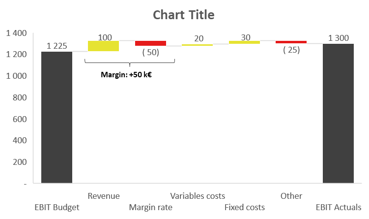
Ever needed to compare two results, like EBIT or net sales, and explain the variations between them? That’s where a bridge comes in handy!
Here’s how to build one:
- Create a table: Start with a table that lists the starting point on the first row, the end point on the last row, and the various variations in between. You may need an “Other” line to ensure the bridge is complete.
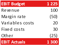
- Insert the Bridge: Select the table, go to Insert > Waterfall (Alt > N > I1 > Enter)
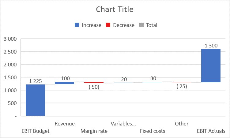
- Customize the Appearance: Set the title in bold, delete the gridlines and borders (Alt > JA > SO > N > Enter). Change the colors in the legend to green for increase, red for decrease, and dark gray for total.
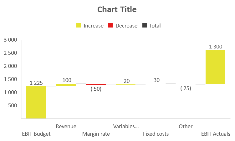
- Final Touches: Delete the legend. Double-click the first and last columns, then right-click > Set as Total. You should obtain something similar to this:
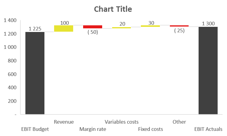
You can now copy the bridge image into PowerPoint, position it on the left, and add commentaries on the right. For specific comments, consider adding brackets such as in the example below:
